Carry a restaurant’s identity across its interior by repeating a small set of recognisable cues while giving individual features a clear role. Salmon Noodle Retail in Surabaya, Indonesia, shared on FIRST Indonesia’s Instagram, brings this restaurant interior branding approach into focus through circular accents, monochrome imagery and sculptural white ceiling forms. The caption describes a contemporary, Japanese-inspired aesthetic with a black-and-cream palette and warm wood textures.
Repeat recognisable cues, but give focal points room
Choose which visual elements should repeat before commissioning a signature feature. For a restaurant owner or brand team, that means deciding which colours, shapes, lettering styles and image treatments belong throughout the design—and which should remain occasional accents. Avoid asking every surface to make an equally strong statement.
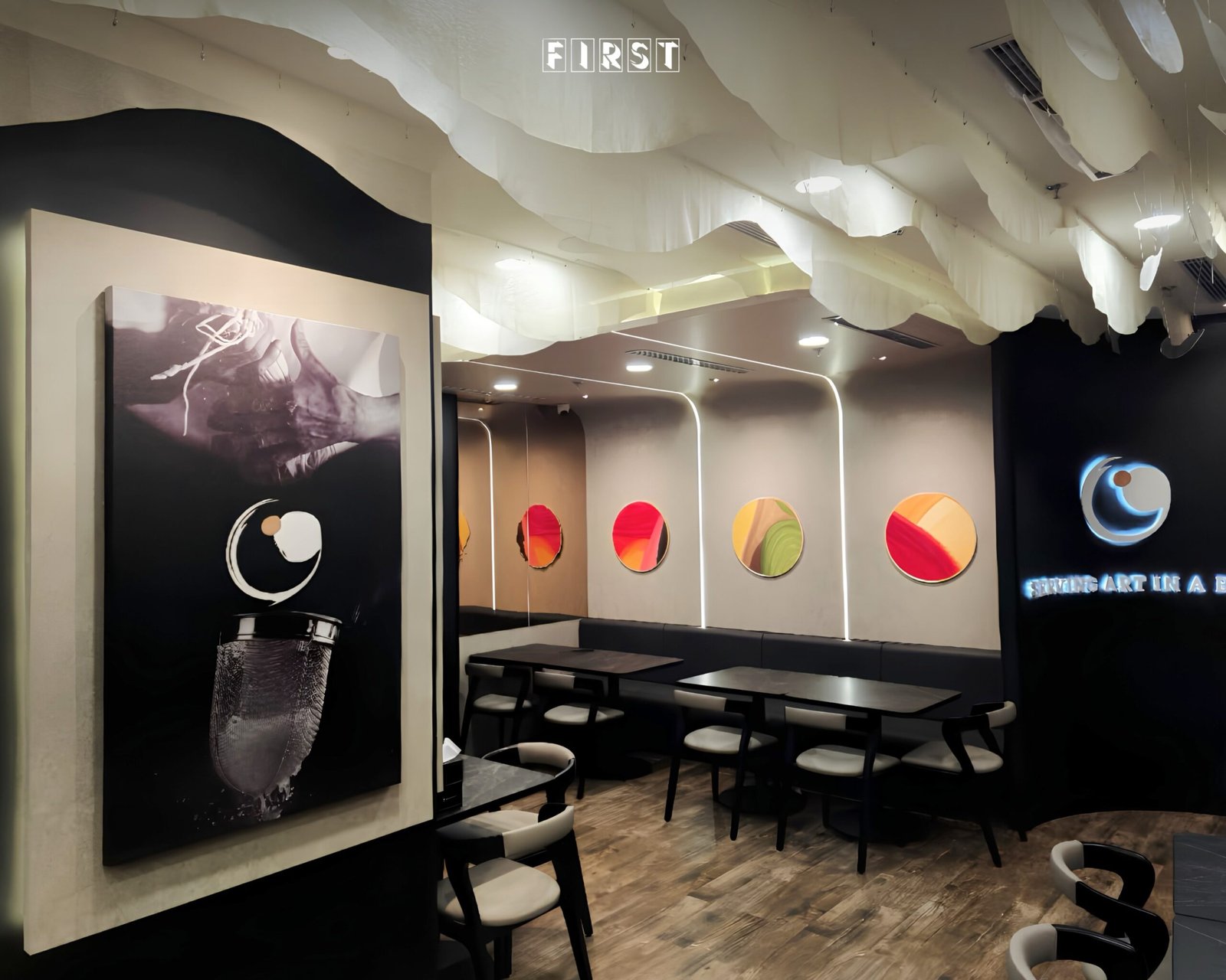
Salmon Noodle’s contrast between dark surfaces and pale framing provides a common background for more expressive details. Colourful circular features and large monochrome artwork take different forms, yet both sit within that restrained frame. When briefing your designer, distinguish the background palette from the accents rather than treating every colour as equally prominent.
A service counter deserves a clear focal point without becoming a separate visual identity. Salmon Noodle’s counter sits beneath a large red form, beside a tall text-and-image panel; white ceiling forms continue overhead. The red feature reads as a distinct emphasis, while the ceiling treatment and monochrome imagery echo details used with the seating.
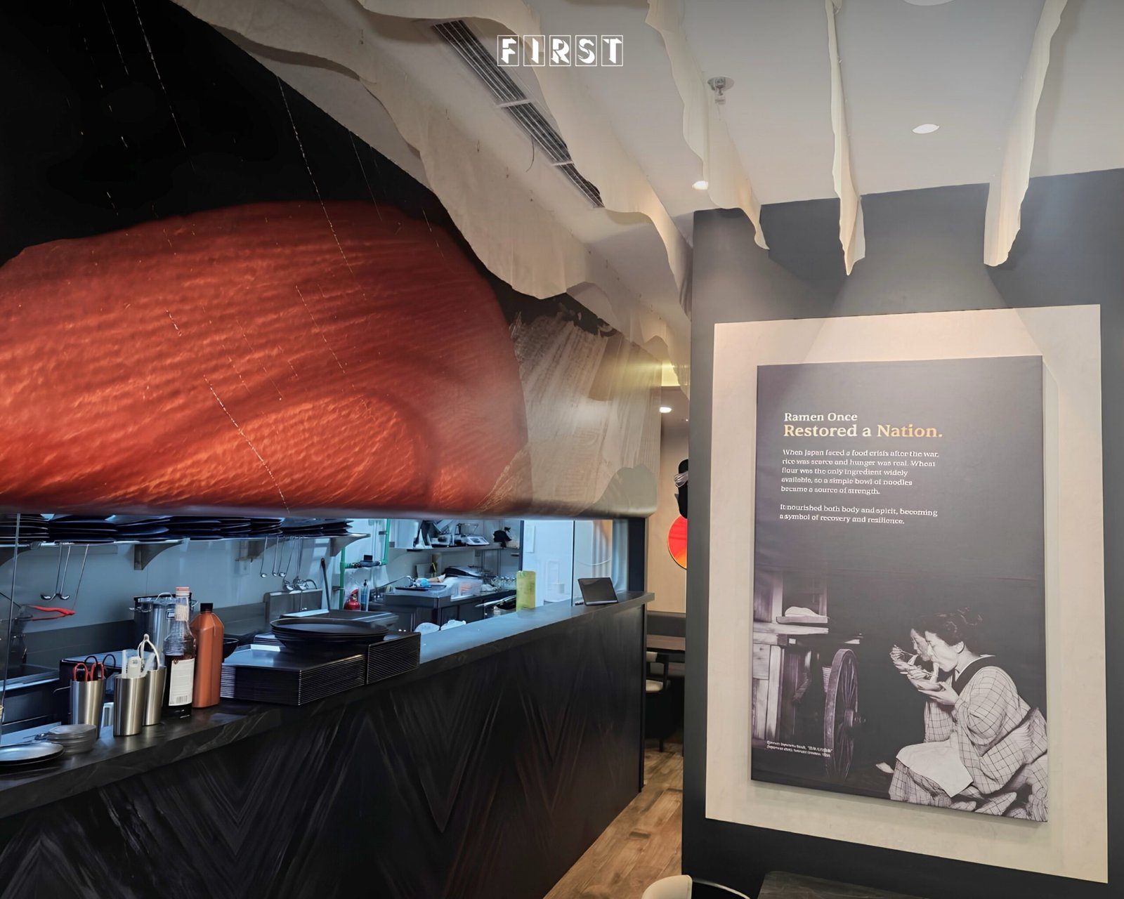
Review a counter’s branding alongside its everyday equipment. Ask your designer to include utensils, dishes and other visible working items in the presentation, rather than showing only a bare counter. Keep the main graphic or sculptural feature distinct from the information staff and customers need to read.
Match graphic scale to viewing distance
Separate the message people should recognise from a distance from the detail they can read close up. A restaurant name, a large image and a paragraph of text need different treatment. Give each a clear place instead of enlarging all the content to compete for attention.
Salmon Noodle’s frontage uses a broad black graphic wall with pale map shapes, place names, restaurant-related lettering and a large food photograph. The glazed frontage carries Salmon Noodle lettering beside it. This creates a different graphic treatment from the seating while retaining strong dark-and-light contrast.
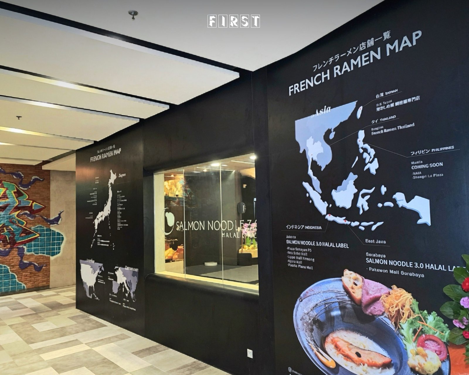
Ask to review frontage artwork at its proposed scale and from the intended approach. Decide what should register first, then place supporting text where it can be read at closer range. Treat maps and editorial panels as content that needs its own approval, not simply as decoration.
Review restaurant interior branding as a whole
Approve the relationship between features, not just each feature on its own. Ask for an overall design presentation that puts the frontage, counter and seating treatments side by side. Check whether they share identifiable elements without copying the same composition everywhere.
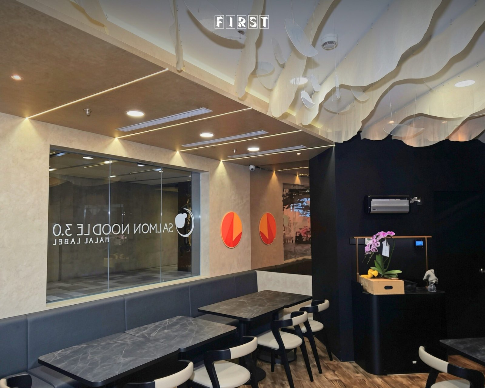
Salmon Noodle’s long banquette setting repeats circular orange-red accents and suspended white forms, with lettering on the glazed partition. Dark seating, light chair sections and wood-toned flooring carry the broader palette through a different seating arrangement.
Before approving your own restaurant design, ask:
- Which visual cues need to remain consistent throughout?
- Where should a distinct focal point take priority?
- Which messages belong at a distance, and which need close reading?
- What can be removed without losing the restaurant’s identity?
The takeaway from Salmon Noodle is to think beyond a single feature wall. Set a recognisable visual foundation, vary its expression to suit each setting, and review the complete restaurant before approving individual details.